常用的容器组件
- Container
Container其实相当于div盒子,没有太多实际作用,但是却不可少,尤其是做某些包裹、添加背景颜色、添加margin/padding等
class Layout extends StatelessWidget {
  @override
  Widget build(BuildContext context) {
    // TODO: implement build
    return Container(
      color: Colors.red,
      child: Container(
        color: Colors.blue,
        margin: const EdgeInsets.all(15),
      ),
    );
  }
}
效果如下
- Padding
同Container,只是添加padding - Center
同Container,元素居中展示 - SafeArea
这个一般不设置属性,直接包裹在外层,主要功能是为了机型适配,比如做iOS的都知道的刘海屏~ - Scaffold
这个容器是一个包含AppBar的组件,其实就是包含一个自定义内容的导航栏
class Layout extends StatelessWidget {
  @override
  Widget build(BuildContext context) {
    // TODO: implement build
    return Container(
      color: Colors.white,
      child: SafeArea(
          child:Scaffold(
            appBar: AppBar(
              backgroundColor: Colors.lightBlue,
              title: Text('容器组件'),
            ),
            body: Padding(
              padding: const EdgeInsets.all(10),
              child: Container(
                color: Colors.blue,
                margin: const EdgeInsets.all(15),
              ),
            ),
          )
      ),
    );
  }
}
效果如下

常用的布局组件
- Column 列布局
列布局,纵向排布
class Layout extends StatelessWidget {
  @override
  Widget build(BuildContext context) {
    // TODO: implement build
    return Container(
      color: Colors.white,
      child: SafeArea(
          child:Scaffold(
            appBar: AppBar(
              backgroundColor: Colors.lightBlue,
              title: Text('容器组件'),
            ),
            body: Column(
              mainAxisAlignment: MainAxisAlignment.start,  //子元素横向排布开始位置
              crossAxisAlignment: CrossAxisAlignment.start, //子元素纵向排布开始位置
              mainAxisSize: MainAxisSize.max,   //宽度
              children: <Widget>[
                Container(
                  height: 50,
                  color: Colors.red,
                ),
                Container(
                  height: 50,
                  color: Colors.yellow,
                ),
                Expanded( //占据剩余所有空间
                    child: Container(
                      color: Colors.green,
                    ),
                )
              ],
            )
          )
      ),
    );
  }
}
效果如下

- Row 行布局
使用同列布局
class Layout extends StatelessWidget {
  @override
  Widget build(BuildContext context) {
    // TODO: implement build
    return Container(
      color: Colors.white,
      child: SafeArea(
          child:Scaffold(
            appBar: AppBar(
              backgroundColor: Colors.lightBlue,
              title: Text('容器组件'),
            ),
            body: Column(
              mainAxisAlignment: MainAxisAlignment.start,  //子元素横向排布开始位置
              crossAxisAlignment: CrossAxisAlignment.start, //子元素纵向排布开始位置
              mainAxisSize: MainAxisSize.max,   //宽度
              children: <Widget>[
                Row(
                  mainAxisAlignment: MainAxisAlignment.start,  //子元素纵向排布开始位置
                  crossAxisAlignment: CrossAxisAlignment.start, //子元素横向排布开始位置
                  mainAxisSize: MainAxisSize.max,   //宽度
                  children: <Widget>[
                    Expanded(
                        child: Container(
                          height: 50,
                          color: Colors.red,
                        ),
                    ),
                    Expanded(
                      child: Container(
                        height: 50,
                        color: Colors.purple,
                      ),
                    ),
                  ],
                ),
                Container(
                  height: 50,
                  color: Colors.yellow,
                ),
                Expanded( //占据剩余所有空间
                    child: Container(
                      color: Colors.green,
                    ),
                )
              ],
            )
          )
      ),
    );
  }
}
效果如下

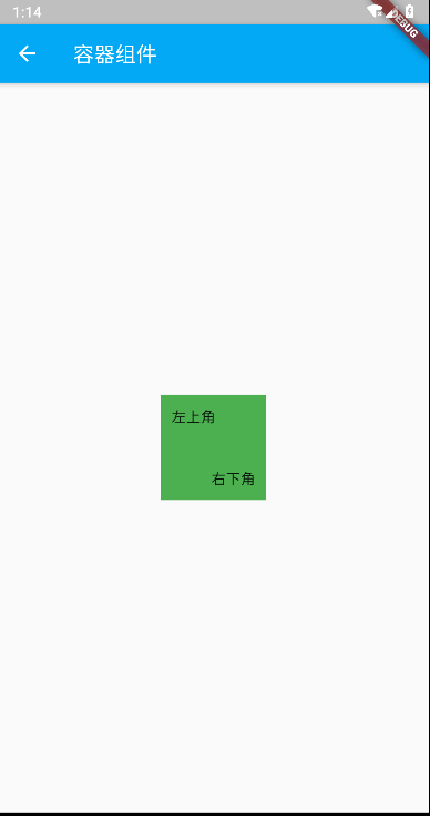
- Stack 层叠布局
直接指定位置,直接看代码与效果吧
class Layout extends StatelessWidget {
  @override
  Widget build(BuildContext context) {
    // TODO: implement build
    return Container(
      color: Colors.white,
      child: SafeArea(
          child:Scaffold(
            appBar: AppBar(
              backgroundColor: Colors.lightBlue,
              title: Text('容器组件'),
            ),
            body: Center(
              child: Stack(
                children: <Widget>[
                  Container(
                    width: 100,
                    height: 100,
                    color: Colors.green,
                  ),
                  Positioned(
                    left: 10,
                    top: 10,
                    child: Text('左上角'),
                  ),
                  Positioned(
                    right: 10,
                    bottom: 10,
                    child: Text('右下角'),
                  ),
                ],
              ),
            )
          )
      ),
    );
  }
}
效果如下